Overview & Purpose
Great Lakes Pot Pies, a Michigan-based, women-owned business specializing in small-batch comfort food, engaged Douglas Marketing Group (DMG) to lead a full brand refresh and packaging redesign. The goal was to elevate the company’s market presence in preparation for national expansion, while preserving the brand’s community-rooted values and identity.
Strategy & Execution
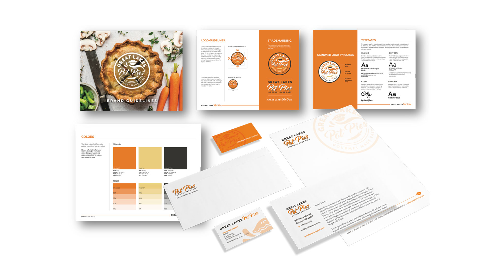
The project began with an immersive brand discovery, focusing on the memories and comfort evoked by homemade food. Our approach was grounded in storytelling, channeling the heart of the brand into every design element. Key components included:
- A warm, earthy color palette inspired by baked crusts and wholesome ingredients.
- Typography and design motifs that reflect craftsmanship and culinary heritage.
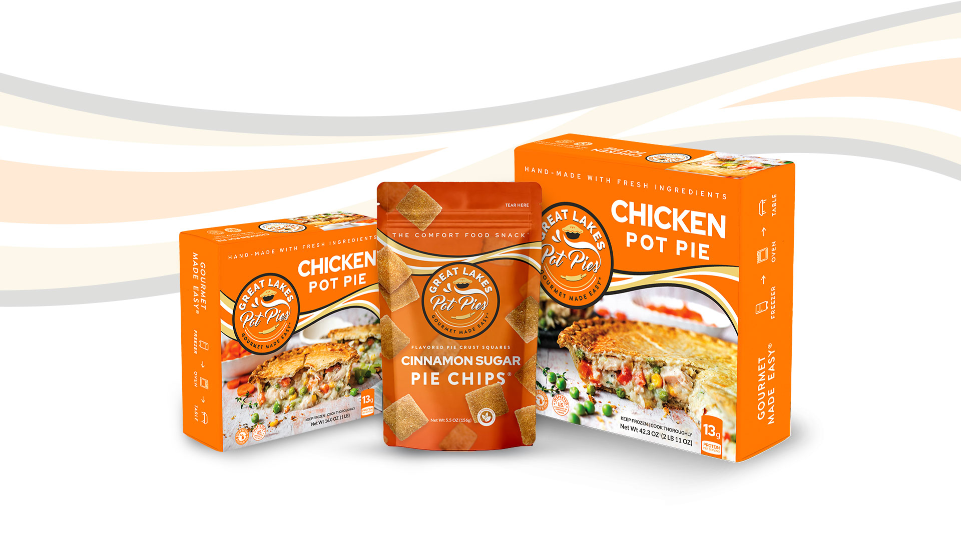
- Packaging that balances shelf appeal with functionality and regulatory compliance.
- A flexible system to support future product launches and retail expansion.
- Consistent application of the brand’s core message: Gourmet Made Easy®.
The design was also created with sustainability and scalability in mind, ensuring ease of production across multiple SKUs and packaging formats.
Why It Worked
This campaign succeeded because it honored the brand’s authenticity while positioning it for growth:
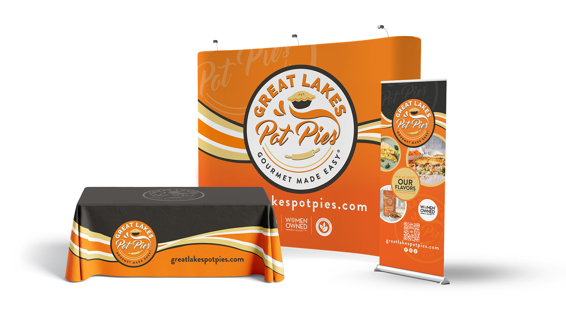
- Visual storytelling captured the essence of small-batch quality and homemade comfort.
- Packaging stood out in both boutique and national retail environments.
- The cohesive system reinforced brand recognition across product lines.
Results
- National distribution growth for Pot Pies and Pie Chips.
- A Gold Hermes Creative Award win for excellence in packaging design.
- Strengthened consumer trust and emotional connection with the brand.