Overview & Purpose
Essex-Windsor EMS engaged Douglas Marketing Group (DMG) to develop a comprehensive and recognizable visual identity that communicates the organization’s values of accountability, integrity, and compassion. The goal was to support public education, recruitment, and operational visibility while fostering stronger community engagement and internal team pride.
Strategy & Execution
Spanning nearly a decade, DMG’s partnership with Essex-Windsor EMS focused on translating critical service values into a powerful visual system. The strategy was rooted in creating consistency across all brand touchpoints and enhancing the public’s understanding of EMS roles. Core initiatives included:
- Brand Identity Development: Creation of design standards that work seamlessly across digital, print, apparel, and fleet assets.
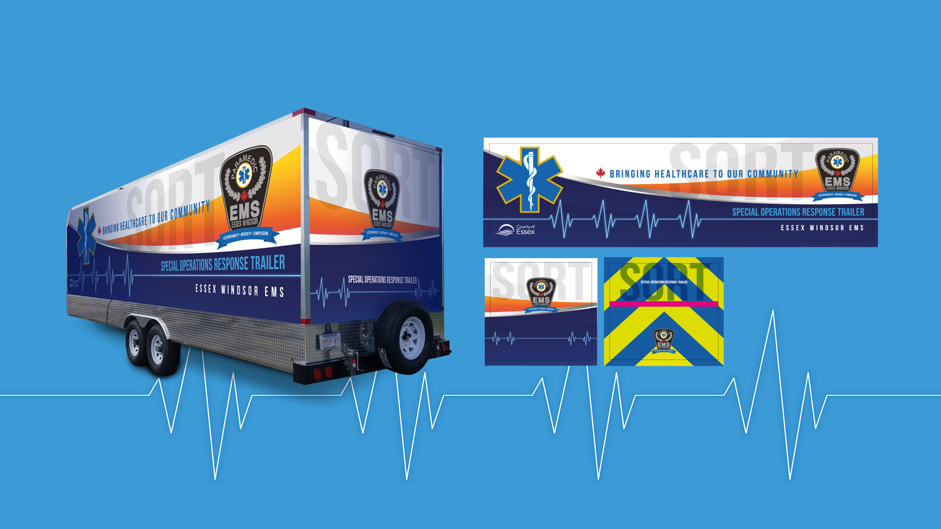
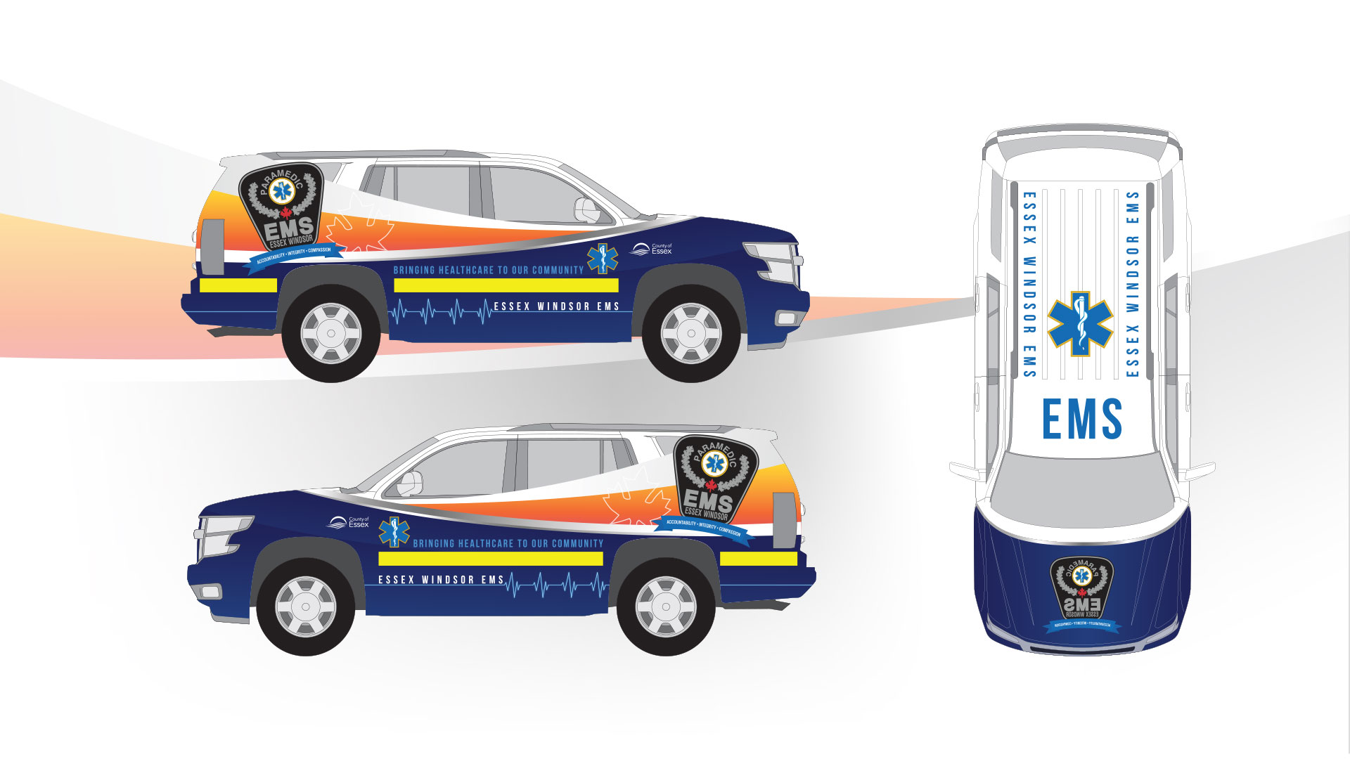
- Fleet Design: Vehicle wraps for ambulances and Special Operations Response Trailers that ensured visibility, professionalism, and operational clarity on the road.
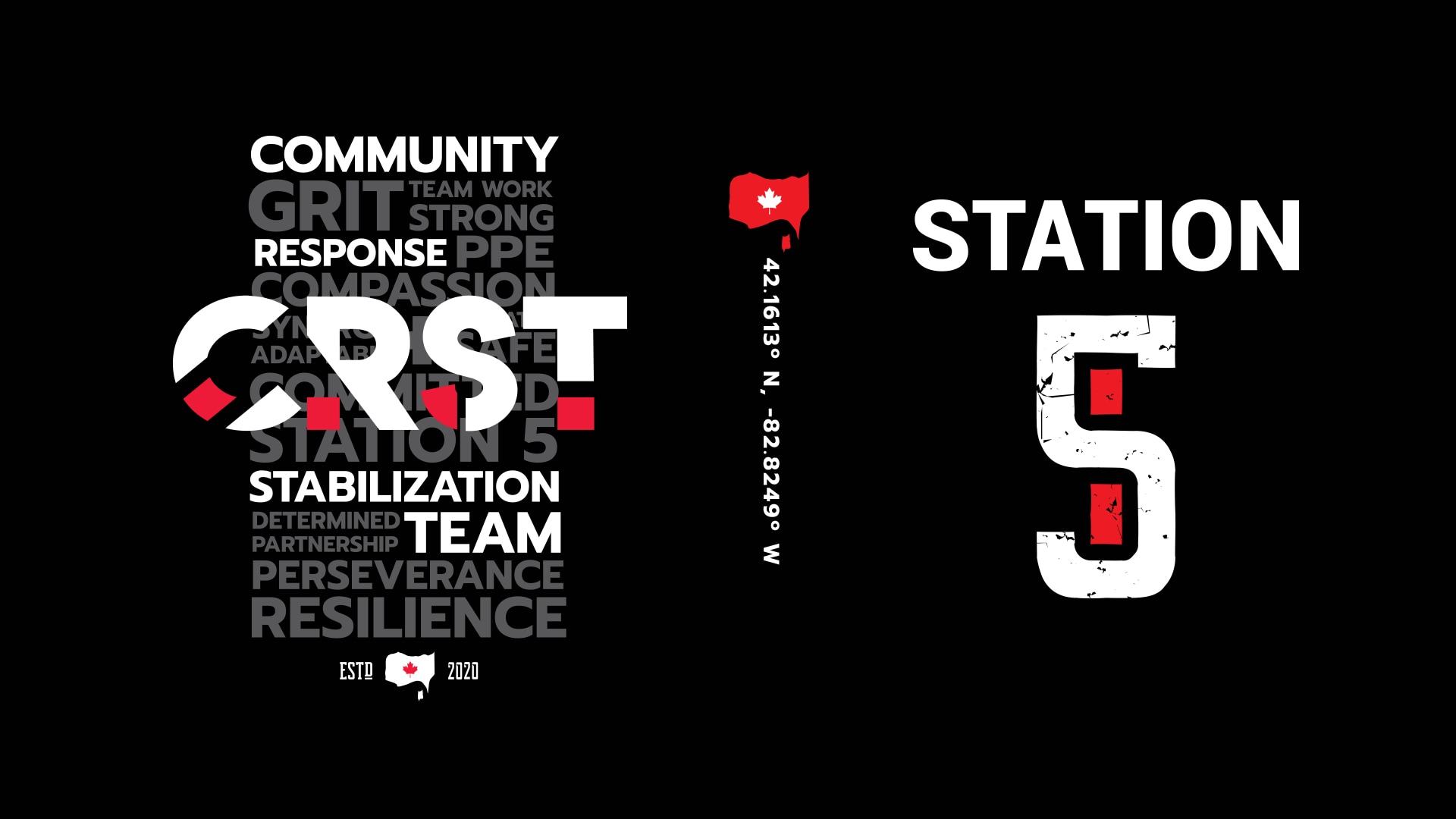
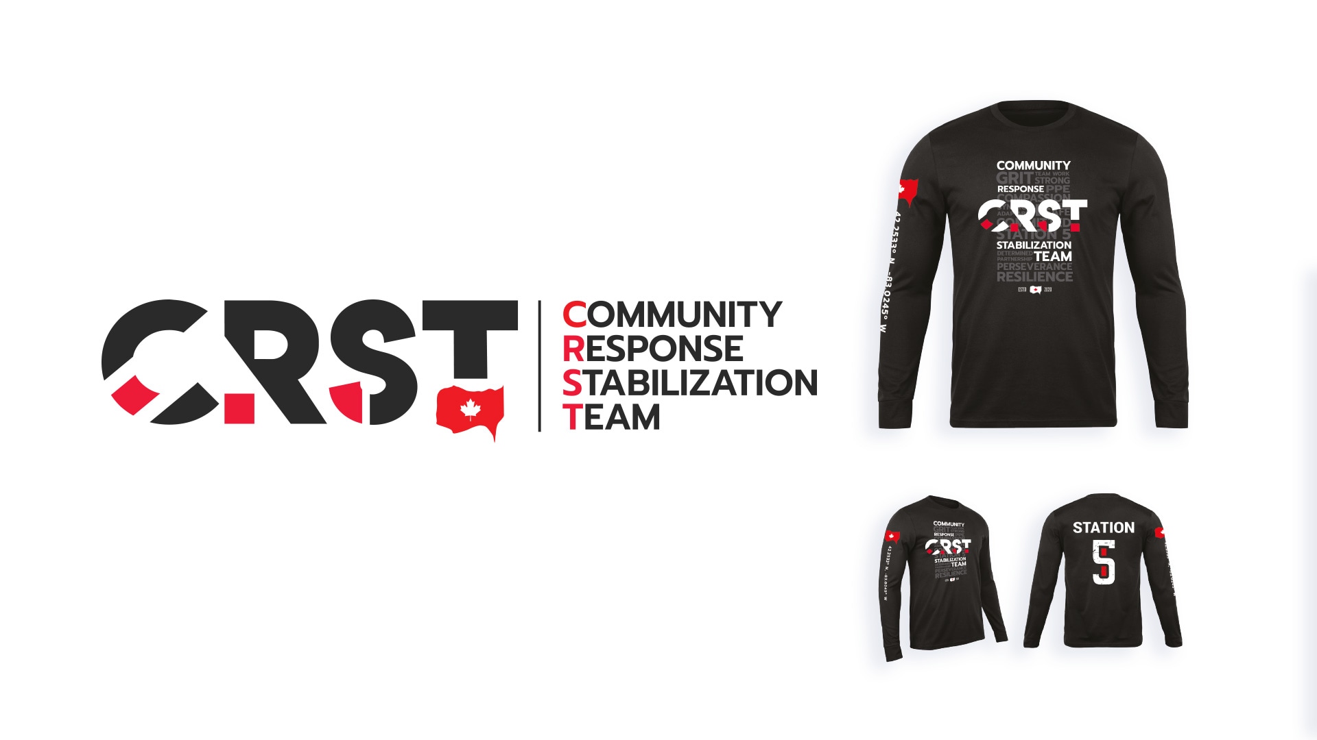
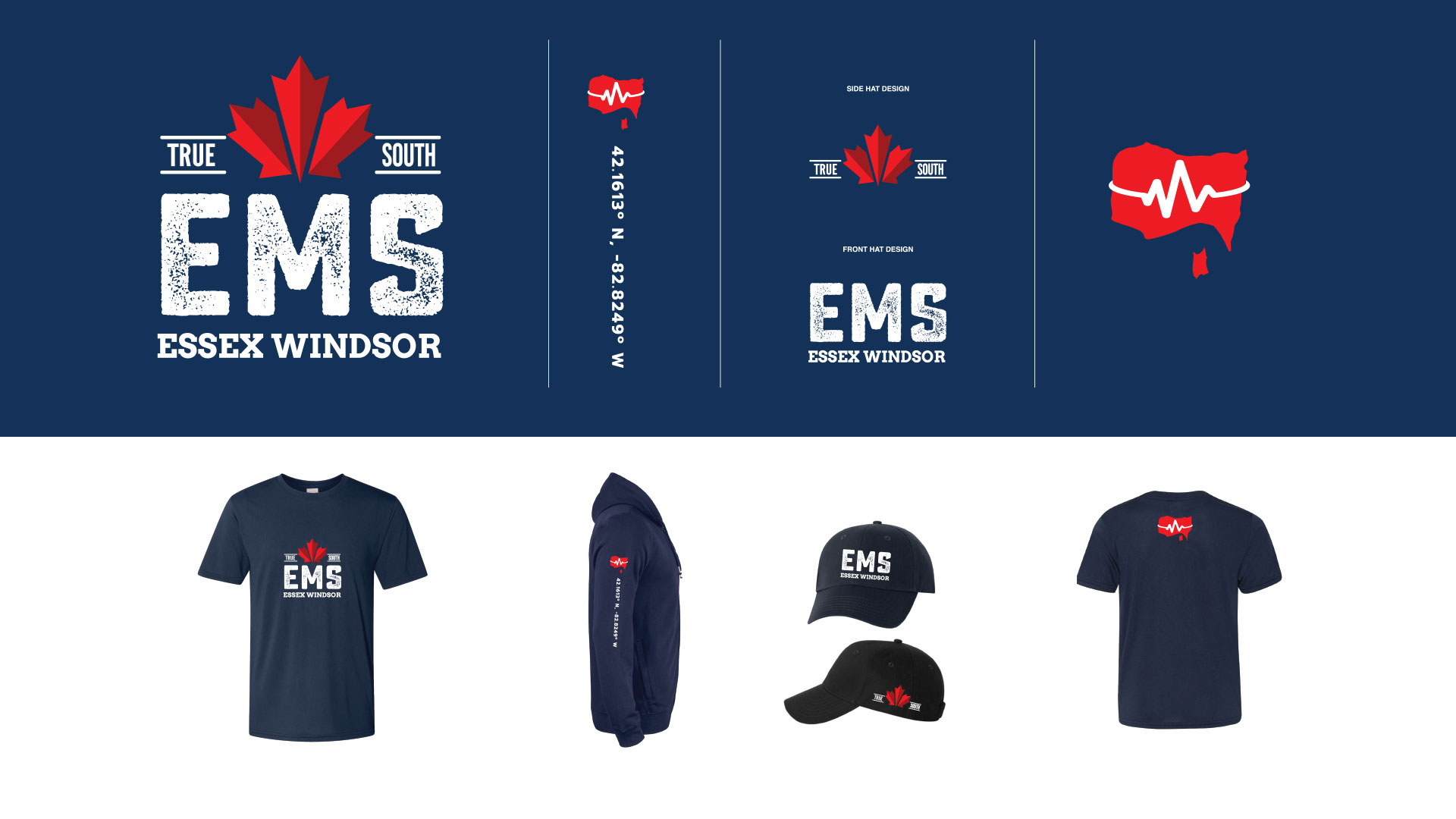
- Apparel and Internal Branding: Custom uniforms and campaign-branded gear, including designs for the Community Response Stabilization Team (CRST) and the “True South” initiative, fostering unity and recognition.
- Recruitment and Public Campaigns: Development of printed collateral, branded assets, and targeted messaging to support hiring and public awareness.
- Video Storytelling: Production of emotionally resonant video content, including survivor narratives and paramedic testimonials, to humanize and highlight the essential work of EMS professionals.
Each creative output was carefully crafted to resonate with both internal audiences and the broader community, reinforcing the vital role of EMS in public safety and health.
Why It Worked
The success of the Essex-Windsor EMS campaign is attributed to a strategic, values-driven design approach combined with long-term partnership stability:
- Consistency Across Channels: Every asset, from a vehicle wrap to a recruitment flyer, reinforced the same core identity.
- Operational Functionality: Designs enhanced both usability and visibility, never compromising safety or performance.
- Emotional Connection: Video storytelling and campaign messaging strengthened public appreciation and internal morale.
Results
- A unified and recognizable EMS brand across all communication and operational vehicles.
- Increased visibility and trust in Essex-Windsor EMS among community members.
- Stronger recruitment engagement and elevated internal team cohesion.
- Award-winning creative output that aligns with EMS’s core mission and enhances their public presence.